

Brief
In 2019, Temple began rolling out a refreshed university-wide brand and visual identity. After developing a direction with our partner agency, the work came in-house to be expanded for the university’s marketing needs. The central institutional identity offers broad visual direction, but communications must be tailored for Temple’s diverse audiences. The most critical need in university marketing is undergraduate recruitment—the way a school introduces itself to prospective students and their families.
With the central identity mostly resolved, I spearheaded the customization of communications for the prospective undergraduate audience. I collaborated with a cross-functional team to build comprehensive guidelines that could be applied across print and digital media, providing for brand alignment across 17 schools within the university.

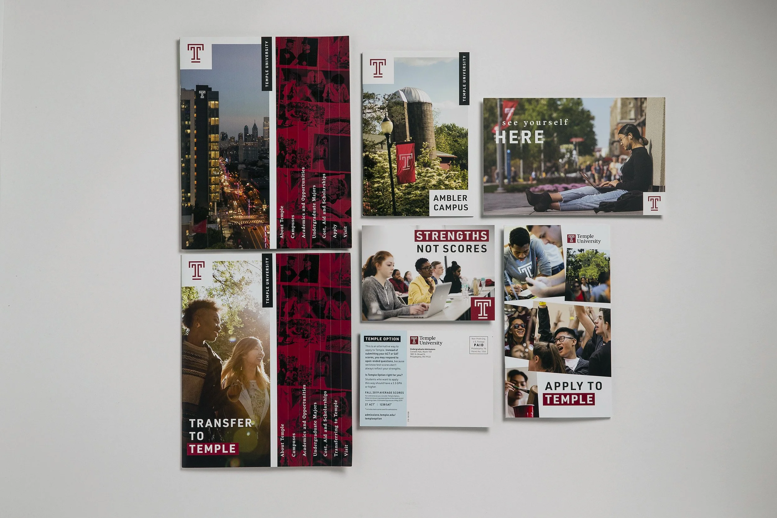
Samples of 2019 enrollment materials featuring the new visual identity
Vision
To understand how the brand could flex for different audiences, we began to think of our messaging and visual strategies for the institution the same way you may dress differently based on your activity. Some brand tones are your Sunday suit and others are your gym clothes; the undergraduate enrollment tone is like day-off street wear—a relaxed identity with a free, gritty feel to connect with our target audience. The visual system references scrapbooks, zines, social stickers, and handwritten notes—a vernacular style that may feel familiar to Gen Z students. Another highlight is the introduction of a new “landmark pattern” that features graphic imagery of iconic campus locations and architecture.
Results
This guide was deployed across the university in early 2020 and was met with a positive reaction from partners across campus. Although each department has different ways of working and completing design projects, all have found benefit in the clarity this guide provides. Further, our partner agency has used the guide I created as a template for their later work with Temple.