Brief
Project Management Institute (PMI) is a nonprofit organization for professionals in the project management field; with a global presence, there are hundreds of chapters around the world. Largely unchanged for decades, PMI underwent a global rebrand in the late-2010s. While a gorgeous design system was rolled out to the organization, each chapter was given the flexibility to include a personalized icon in their own mark.
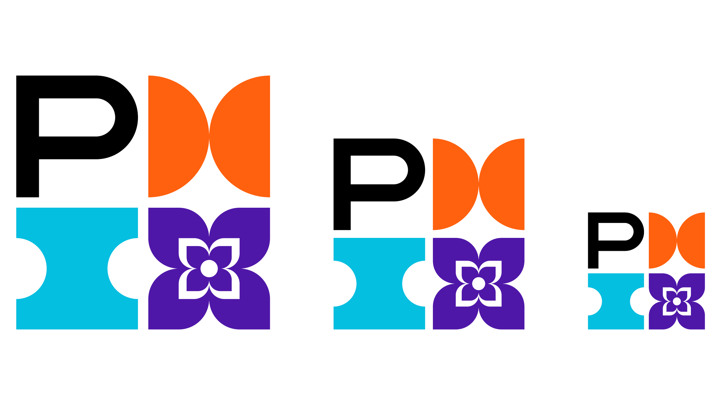
The new PMI logo system is comprised of a monogram mark with the letters P, M, I arranged in four quadrants of a square grid—the fourth being a variable space. For chapter logos, the variable space is often an icon that represents the chapter’s location, such as a crab for the Baltimore chapter and the Gateway Arch for the St. Louis chapter. I was approached by the then-vice president of marketing for the Rochester, NY chapter to create the icon for their mark.

Vision
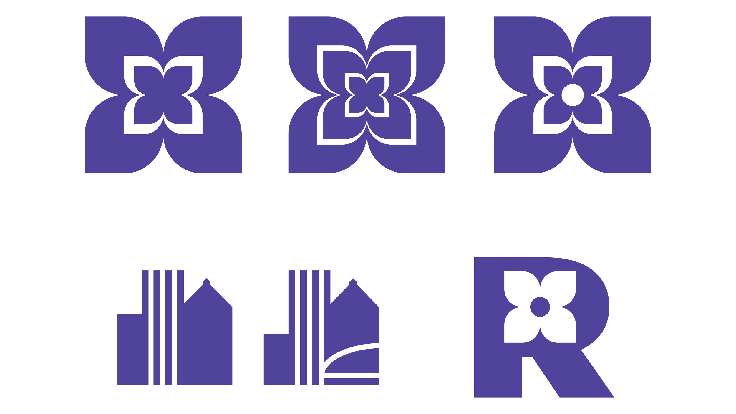
The city of Rochester has many nicknames, chiefly the Flower City and Lilac City. The PMI Rochester team felt these nicknames really resonate and wanted to see options playing off the flower/lilac themes. The also asked for a more architectural option representing the city’s landmarks and skyline. I explored both of these themes as an icon for the logo, along with a monogram R for Rochester—with the counter being replaced by a lilac shape.

Results
After several rounds, the team settled on the flower icon, and we worked together to refine the geometry and lines for maximum recognition and legibility at many sizes. The final mark was well received and remains a proud part of PMI Rochester’s identity.
